


Text Effect Photoshop Tutorials

Create a Retro 3D Halftone Text Effect in Photoshop
In this tutorial I will show you how to create a 3D Halftone Text Effect in Photoshop that can be used as a cool rock band cover using some cool flash shapes, the Text Tool and a lot of different layer styles.
... Read More
Creating a Letterpress Effect Using Text and Shapes
In this tutorial you will learn how to add the letterpress effect that many posh and specialized prints have. This involved adding specific blending options to text and shapes, plus some creative use of brushes and textures. While it sounds simple, there are some special moves here that might be a bit confusing for beginners.
... Read More
Bright Rope Light Text Effect
Create a bright sparkling rope light inspired text effect.
... Read More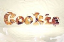
Create an Interesting Cookie Bite Text Effect in Photoshop
In this tutorial, I will show you the steps I took to Design a simple Cookie-Bite Text Effect in Photoshop. We will be practising some basic techniques such as the use of quick selection tool, layer masks and layer blending options. This is a beginner level tutorial and the steps are easy to follow, have a try!
... Read More
Create a Glowing Liquid Text with Water Splash Effect in Photoshop
In this tutorial, I will show you the steps I took to Create a Glowing Liquid Text Effect in Photoshop. We will be practising the use of liquify filter, layer blending options, as well as some image adjustments. This is a beginner level tutorial and the steps are easy to follow (well, the hardest part may be the liquify filter usage), have a try!< ... Read More

Ombre Text Effect
Create a glossy Ombre text effect using a gradient fill, two simple filters, and some Layer Styles.
... Read More
Create a Bloody Text Effect in Photoshop Using Layer Styles
In this quick tip tutorial we will show you how to create a bloody text effect using layer styles in Photoshop. Let's get started!
... Read More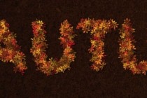
Colorful Autumn-Inspired Text Effect
Create a lovely colorful Autumn-inspired text effect using a simple brush, some layer styles and a couple of adjustment layers.
... Read More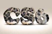
Easy Furry Text in Photoshop
We have been posting tutorials for almost 6 years and our goal here was and will always be trying to share easy techniques we've learned along the way. We try to make the tutorials short and open to adaptations so you can add your touch in order to create an unique result. That's the case of this week's tutorial. It's a simple Ph ... Read More

Polished Stone Text Effect
Use multiple Layer Styles, a cool Gradient Inner Glow trick, and simple filters to create a glossy polished stone-like text effect.
... Read More