When a star like our own reaches the end of its life, it begins to run out of hydrogen fuel in its core. Like a car running out of gas, it will begin to sputter, swelling to a size that could encompass every planet in our solar system out to Mars. When this happens, the sun will swallow the Earth and will spell certain doom for all life on our planet. Today's tutorial is part of a 4-part series depicting the journey of the inhabitance of a dying world that must travel into the unknown to find a new world to call home. In this series, we will explore the cosmos from the perspective of this fictional civilization making their way through the universe and will demonstrate the techniques that you can use in Photoshop to depict your own cosmic scenery. In addition to written content, this tutorial also includes about an hour of video instruction to help you along the way. So what are you waiting for? Let's get started!
Tutorial Assets
The following assets were used during the production of this tutorial.
Step 1 - Creating Our Brushes
This step is very important, we will be using these brushes and this brush creation process extensively throughout not only this tut, but through the whole series. So I will show you the creation of some brushes and that will easily take you onto creating your own collection. We will be using the textures I made provided in the download link 1 and 2 for this so go ahead and get those first, of course that is my selection yet you might find something that you prefer or make your own, either with your camera or with a texture generator software. I used Artmatic for most of them but its Mac only, yet you have an awesome alternative on windows called Genetica. OK got them all? let's open up this one below.


Now let's trace with the lasso tool the features we want to include in the brush, just set the feather of the lasso tool to around 50px so we get a nice soft edge.

Next do a copy and paste on to a new layer so we get our selection out of the background.

And then just scale it down a bit nice and centered so that our brush its not too big; if the selected portion to define the brush its too much, the define brush preset option might not be available.


Perfect; next invert the image and erase any dark border softly with a big soft brush. Whatever you select to create a brush, black and gray tones will appear when you stamp your brush, and white means the opposite, nothing will appear.


Here you see I selected the eraser with a big soft brush and below you can see the areas that needed erasing a bit so there will be no sharp edges in our resulting brush.


Just be sure the size falls into an accepted range for a brush, if not scale it a bit more. Don't worry you will know if its too big, the option will be grayed out.

Once you have it ready just drag a square selection around it leaving breathing space and with the content centered. Then go to the menu and select the define brush preset option.


Now let's make a document the size of the piece we will be working on, I selected the settings shown here, fill the document with black and create a new layer for the testing so you don't mess up our black background.

OK now select a bright color for the tests, I selected bright yellow since we will be working with the fire of the sun. Then scroll down the brush list to find the newly created brush.


Stamp it once first to see how it looks, like it very much; yet if you need to do adjustments go back to the image, erase more if you need, or repeat the selection process, or even adjust the levels to alter the contrast and then define the brush again.

OK now most of the time we wont be using the brushes just as a stamp so we must see how they behave with different options enabled. So check on shape dynamics and transfer in the brush palette with pen pressure control.


Let's test this again, looking good so far, play with the palette options so you start to get a feel of what everything does and affects your brushes.

For example for this brush I decided to try out some more angle jitter and tested it again.


Next on we will be doing a couple of more brushes so you get the hang of it plus you will see some differences in each. Even though I assume most of you already have the creation process down read on with the rest of us. OK so open this other texture I made.

So again with the lasso tool and a feather of about 50 px which you must remember to set back when we finish with the brushes or all your selections will be 50 px soft. OK so select the part of the texture that has interesting details and copy and paste it on to a new layer and then hide the original.


Then scale it down nice and centered followed by an invert Command/Ctrl.


Let's now adjust the levels for this one a bit also as shown here.


Nice in this case I think we are ready to define the brush preset. Name it or just click OK; you can always rename your brushes later.


Again scroll down the brush list and find the newly created brush, select it and do a test stamp. Looking quite nice to me.


Then as we did before let's try it out with some settings enabled to see how it will work. Go ahead and select shape dynamics plus transfer all with pen pressure enabled.


I like the results, I don't think we need adjustments.

Happy with the last one let's go on to this other texture and find a good zone for another brush, this image has a couple of good zones so we will be getting 2 brushes from it.


OK go ahead and repeat the process; copy and paste to a new layer, invert, scale it down, and in this case adjust the levels as shown here.

OK now drag the selection for this brush define the brush and let's go test it.

Let's go all the way down the list again, find the new one and do a test stamp. This one looks very very nice


Enable the usual shape dynamics plus transfer; yet this time adjust the angle jitter slightly and do a test stroke.


This one really looks sweet, let's try this same brush blocking capabilities so select black and stroke on top of the test, Very very nice we have a gem here.


Now brushes are not limited to this options, you can apply texture to the existing brush, and you can combine the brush with another brush as shown below. Test it out and see the effects you get.


Here are my results with the settings above; ain't that interesting. OK let's move on we have much to do.

This same texture has this very interesting zone that might make a delightful brush so select something like this below and of course copy and paste it on to a new layer.


Then again invert the image and adjust the levels as shown here.

Nice, now define the brush as you already know and let's go to the test document, find the new brush and stamp once. Lovely I knew it was going to look cool.

Let's now enable our basic settings for shape dynamics and transfer to do a stroke test. Looking very nice also; this texture is a success.


Now let's move on to another sweet texture that has also a couple of sections we can use separately; go ahead find and open this one below.

OK let's start with the section shown here, so grab the lasso again and select something similar, then copy and paste it to a new layer.


Now let's invert the image and ...oops we don't need those red tones, we can hardly see the features of it. So let's desaturate the image so we only get grays.


Nice that is much better now let's adjust the levels a bit to get more contrast as shown below.


You can see the results below, now let's make the selection and define yet another brush preset.


Scroll down the list of brushes and test this one too, if you are satisfied let's move on.

Let's now choose this other section of the texture and follow the same process, copy and paste it to a new layer, this time desaturate it first since we know we will get the red inverted result.


Next invert it and adjust the levels as shown here.


Great nice looking brush, so now drag a selection for it and define a new brush preset.

Next let's find it and test it; if you tested the other selection from this texture you can see both have similar features yet slightly different patterns, we have two delightful cloudy brushes. Go ahead and test it with the palette options enabled.


The last brush I will show you its not from a generated texture, its from an image in case you don't have access to any texture generating software, or you prefer to take images of your textures with your camera, which is just as good. So let's open up the image here from link Texture2.

The process is more or less the same, define the elements to include in the brush, just have in mind that the brush will be inverted when selecting the features. Copy and paste to a new layer and scale the resulting section a bit centered in the image.


We will also desaturate this one to get rid of any distracting color information and we will also invert our results.


This one will also benefit from some levels adjustments to set the contrast to our liking.


More often than generated textures, images need for us to fine tune the edges erasing bits and making it softer. So grab the eraser and with a big soft brush erase as shown below.


Now that you have erased what is needed then just as we have done before drag your selection for it.


Then define the brush preset, name it or just click OK.


And of course let's go to our test document, find the brush all the way down the list and make a test stamp.


Now let's enable the options we have been working on, in this case I varied the spacing just a bit. And do a stroke test. Do some variations, get to know your brush capabilities and properties. We have finished with this step, go ahead use as many textures as you want do as many brushes as you want; just remember big brushes like this slow down Photoshop's load time so keep your collections restricted, I recommend not to have huge lists of brushes. You can also load the brush file I used so you have the same exact brushes for the rest of the tutorial and for the rest of this series.


Step 2 - Sun Texture
Now we will be creating the base for our main character the big red giant star, we will be using the same document where we have been testing our brushes, simply delete the testing layer and grab the ellipse shape tool with a medium gray and while holding shift we define a huge round shape that exceeds the boundaries of our canvas as shown here and if needed we scale and move it into position.


Great, once you have it we need to rasterize the layer and lock the content as shown below.


Next we will be using several of our newly created brushes to create the texture of this great big star, we can start with this one here and setup the brush palette as we have done in the testing.


This is a very personal process; what looked good to me might not look as good to you, to check out exactly what I did follow the video. Paint some texture with black, and then change the brush, maybe to this one below, and paint some more.


Keep on changing the brush adding new surface features, if it turns to dark you can change the color back to a lighter gray and alternate between the black and the gray as well as with different brushes and settings.

OK this is what I came up with, a nice varied surface that we can work with.

Once you are satisfied with your results we need to make this texture have the appearance of a spherical body, let's start by using the layer to make a selection of it by hitting Command/Ctrl + click on the layer thumbnail (Command/Ctrl + click windows)


Once you have the selection apply the spherize filter twice with the settings shown below.


Perfect, this is the result so far after the filter has been applied.

Next we will create a couple of adjustment layers for our sun surface so we can tune it and make it look like a sun. First create a levels layer and adjust it as shown here. You can see the increased contrast results below.


Then create a hue/saturation layer and adjust the settings as shown below.


When you are done grab both layers and create a clipping mask so they only influence our suns surface


Nice, now we have a big orange texture that starts looking like a sun. We will now begin a several stage process of making this surface unique and ours by using the smudge tool and adding some delicate flow to it on several of the sections.

You can clearly see this process in the video, yet here is a before and after captures so you can see what we are after


Step 3 - Sun Adjustment Layers
Before continuing we must make this surface really feel like a giant star, so we will be adding several adjustment layers and several layers with different layer modes to achieve this, so let's start with duplicating the layers that we have up until now and set this new surface copy to overlay mode.


Now change the settings for the adjustment layers for this new surface as shown here.


Now select all this new layers and duplicate them once again, only this time merge them together.


Set this new layer mode to overlay and make a duplicate of it.


Next on this last duplicate we will apply an emboss filter as shown here.


We will then set this layer mode to hard light and reduce its opacity as shown below.


Now select all the layers we have created, including the original and drag them to the folder icon to quickly make a group of them. Once you have the group then duplicate the group as shown below.


Now merge the group, hide the original group for safe keeping and duplicate the resulting layer.


We will keep the duplicate just in case we need to go back to it, so for now just hide it.

OK now we have a solid layer with bright orange and red that looks much more like a star surface; we can now continue our ongoing process of making this surface unique with more flows and surface details, so let's grab the smudge tool once again and starting in the section shown below let's continue with the process.


Select the brush shown here for this and start smudging features and flow as shown below.


This is also much better appreciated by studying the video for this section since its impossible to duplicate my every stroke you need to get the idea of what we are after. Here you can see my results for this stage; remember you have a safe copy for this, so don't be afraid to have fun adding detail and features you can always go back to the copy and start over.

Step 4 - Flares and Wisps
It is now time to generate the huge wisps and flares that erupt form the stars, so once you are finished and satisfied with your work in the previous step let's duplicate our layer and delete the one we had for safe keeping.


Now on the newly created duplicate let's continue our work first with the smudge tool, so grab that one and select a brush as shown below.


I can only show you a sample of what needs to be done here so again be sure to watch the video so you don't miss anything in this process. The idea here is that from the bright areas of our sun, huge flames and flares shoot out onto space, but then get pulled back to the surface by the suns gravity. So let's start smudging as shown below to create these arches.


OK we can only go so far with the smudge tool, we must also paint in some detail so grab the paintbrush tool and selecting a very small brush as shown here and sample a bright yellow as shown below now let's paint some wisps over the work we have done with the smudge tool.


You can see in the next sequence what we are trying to do here; we have smudged the base of our flares and where needed we paint in some more length and detail to this as shown below.


We will go on with the brush tool in sections such as this where we don't want to pull of the surface and paint in the wisp shapes that we need as shown below.


Then sample an even brighter yellow from the surface and add greater intensity to the crest of these wisps.


Then when you are finished grab the smudge tool back to soften a bit of these strokes, and enhance the flow of them as shown here.


Here is what I have come up with so far and I can't stress this enough, watch the video, be creative, have fun.

Step 5 - Corona
OK for this next step we will be creating the suns corona and activity that lies beyond the surface. Let's start right away with a new layer, choose a deep dark red as the one below and fill in the layer.


Now set the layer mode to soft light and reduce the opacity to about 55% You can see the results this provides us below; a much deeper red star.


OK now let's duplicate our last surface layer and drag it on top this new red layer.

Now let's open up our saved group and on the top layer thumbnail do a Command/Ctrl +click to get a quick selection of the circle of the original layer as shown below, without the wisps.


Now invert the selection and click on the layer mask icon to get a quick mask.


Perfect, now duplicate the layer and hide everything else as shown below.


Now we can clearly see what we don't need for this layer, we want to remove those wisps that extend outside the original circle; so grab the eraser, but hold on don't erase nothing yet.


Now Command/Ctrl + click on the mask thumbnail as shown here to get the selection shown below, and then we can safely erase the wisps.


Once we are done with this, we can make all the layers visible again and with the smudge tool and a brush as shown below let's start pulling out our corona as shown.


Next select this other brush and reduce the size of the brush quite small.

And now with this very small smudge brush you can see below what we are after pulling out small detail out of the basic work we did.


We will do this all around the sun to generate the base for our corona as shown here.

Once we are finished with it let's duplicate the layer and apply a radial blur to it with the settings shown below.


Here is what you should get after the filter.

Duplicate the layer and then merge them together.


Now create a new layer mask for this resulting layer and with a soft brush, mask of randomly until you get a more subtle effect as shown below.


Once you are satisfied, duplicate the layer once again and set this new layer to hard light mode


You can see the result so far here.

Now to make the effect more subtle apply the radial blur to this layer as shown here, which applies it with the same settings as before.

Now on top of this layer shown here create a new layer.


Make a duplicate of the layer below to get a copy of the mask; then drag the mask over to our new layer.

Now just delete the copy of the layer.

Next on sample a bright orange from the surface and select the custom brush shown below at about 715px


and paint some cloudy effect as shown here.

Now sample a slightly darker orange as shown here and paint in some more; remember to setup your brush with both transfer and shape dynamics with the pen pressure option enabled.


Then simply grab the eraser and randomly eliminate some of it as shown here.

Now find this brush here down the list and set up the brush palette as shown below.


With it paint in some nice delicate wisps as shown here.

Now select this other brush and set it up as shown here always with pen pressure enabled.


And with a darker red selected paint a bit more further away from the surface as shown here. Be sure to have a good look at the video to be sure you get the idea of what its been done here.


Now let's go back to our original surface group again to quickly get a surface selection by pressing Command/Ctrl + click on the layer thumbnail.

Once you have the selection, press the delete key for every mask and fill it with black to eliminate everything that sits inside.


Now let's drag our red fill layer to the top and create a new layer as shown below.


Now select the paintbrush once again with a bright yellow color and pick up the big soft brush with the size as shown below.


Now brush some glow as shown here over both the left and right edges.

And then set this layers mode to hard light so we get the results shown below.


OK grab all the layers we have been working on and make a new group from them as you can see here leaving the hidden layers and the red fill outside.

Next duplicate the red fill layer and create a layer mask for it.

OK now select the big soft brush again and make it about 813 px plus an opacity of about 48%.


Now finally using the mask paint in with black to mask off this layer effect from all the area indicated in blue. OK looking very nice so far, we have a very nice looking Red Giant star almost formed.


Step 6 - Planets
In this step we will go ahead and create the planets that are about to be consumed by the great big star, for this we will use the texture from the satellite link offered by the good guys at NASA where you can use all images provided for your projects, so use this one I have chosen or select one that you like.


Then just use the circular selection tool and choose a big portion all the way to almost the border so we get many terrain features included.


Then copy and paste it into our main document plus scale it down to the size we will be using.


Then Command/Ctrl click on the layer thumbnail to quickly make a selection of it.


Then as usual we will run the spherize filter twice with the settings below.


Next, our planet will need some adjustment layers, let's create a levels layer first and clip it to the planet.


Then adjust the levels layer as shown here to create the shadow for our planet.

Now using the layer mask and a soft brush we will mask off the shadow where we don't need it all around the planet as shown below.


Next we will also create a hue/saturation layer for our planet and adjust the settings as shown below.


And finally we will add a color balance layer and adjust it as shown below to get a nice red tint on the mid tones.


OK let's go ahead and create a new layer to add some nice details to our planet so grab a bright blue color as the one showed here.


For this we will need a very small defined brush and adjust the settings for it as shown below with scattering enabled and a maximum spacing setting.


Then just start painting city lights all over the terrain, avoiding the water.


Then just adjust the spacing as shown here.

And with this new setting let's paint some straight lines connecting the cities simulating transport lines or something like that.


Once we are finished just duplicate the layer to enhance the look of it and merge the two layers together.


And there we have it, a sweet planet with detailed city lights all setup.

Steps 7 - 12 Continued Below
You can view steps 7 - 12 using the pagination below.
Step 7 - Ships
OK time to add a bunch of ships leaving this doomed planet, for this we will create a simple brush so we can easily paint in a bunch of tiny ships. Let's make a new 500 by 500 document at 300dpi and with white background, and then select the pen tool and define a simple shape for our ships as shown below.


Now let's change the fill of this newly created shape to black.

Now use the scale tool to make a decent size of it and center it on the document.


Now as we have done many times make a selection, in this case all, and define a new brush preset.


Now name the brush or just leave it as is. Then go back to our main document, find the brush and adjust these settings below.


And paint a bunch of ship shapes leaving the planet.

Too many? Erase some of them like shown here.


Now let's select a bright orange color such as this and a very small soft brush.


OK now lock the pixels on this layer and paint in some highlights as shown below and marked in blue.


Great now we will need a new layer where we will add some tiny windows to the ships, so select a bright blue such as this one and a very small 1px sharp brush.


Let's use almost the same settings as the city lights brush, just vary the spacing a bit.

And add some specs of blue light to all ships as shown here.

Now grab both layers and let's distort them a bit.


Use the distortion tool slightly to get a bit more perspective in our ships.

OK now we will add some engine streaks to each ship, so grab a bright blue color and a very small brush.


Paint some streaks for each ship as shown here.

Once you are finished just duplicate the layer and merge the two together.


Then just set the resulting layer mode to hard light.

Now we will ad a tiny burst to the beginning of each streak so grab this star filter, included in Photoshop and a bright blue color.


We will need a new layer for this so go ahead and create on plus set it to overlay mode.


Now paint in a tiny spec for each ship as shown here.

Perfect, now select the smudge tool and a small brush such as this one below.


Go back to the streaks layer and pull each one of those down a bit as shown here with the smudge tool.

OK we are finished with our ships, but let's easily create another group of ships; grab all the ships layers, streaks lights, all of them and group them.

Now name the group ships and duplicate it.

Now flip the new group horizontally and move it into position as shown here.


Then rotate the group a bit so it looks different.


And finally just erase some of the ships as well as their lights and streaks so you have a different looking group. And that is it, we have reached the end of this step


Step 8 - Planet Effects and Small Planet
In this step we will be adding some nice blast effects to the planet plus we will be creating another small planet or moon to accompany it in our scene. So first we will need a new layer and we will clip it to the rest of the planet adjustment layers.

Now let's pick a bright yellow such as this one and the big soft brush shown below.


Now add a nice highlight around our planet as we can see here.

Now change this layer mode to overlay, and paint in a bit more if you need to accentuate the effect.


Now create another layer below this last one also clipped to the planet.

Paint around in this new layer to enhance the effect and reduce the opacity to about 51%


Now let's do some fine tuning in the planet adjustment layers; go to the color balance layer and adjust as shown below, notice we are not modifying our previous settings, we are modifying the shadows setting.


Next up grab all the layers and make a group; then duplicate the resulting group


Move all of our new group layer and scale it down drastically


Then move it into position as shown here and let's open up the group and find the last layer we worked on the other group copy.


Reduce the paintbrush quite a bit and paint in a highlight for this small planet as shown here.


Adjust this layer opacity a bit more and now just create a new layer on top of everything.


Now we will be using this defined sharp brush and the same bright yellow we had selected; if not just sample a very bright yellow from the canvas. And paint some quick daubs around the planet as shown below.


Now we will need a big round selection for this so grab the circular marquee tool and drag a big selection as shown below.


And now we will apply a radial blur with the settings shown below.


Then we will paint in some more daubs and apply the same filter again


Now let's sample some other yellow/orange from the canvas and paint in some more


Apply the same radial blur and set the layer mode to hard light.

You get the idea of what we are building here we repeat this process until we are satisfied with the look.


Then we will do the same thing for the small planet, paint in some bright daubs in a new layer but this time we will use motion blur instead, with the settings below.


And again we will repeat the same steps until we have the effect we want; then I decided to distort this effect layer to create the appearance of a bit of perspective as shown here.


And that is it we are finished with setting up our planets, just set this last layer mode to hard light, and below you can see the stage we have completed, we have a nice looking piece.

Step 9 - Detailing the Wisps and Flares
Next up its a very long step, yet not much to explain as all its painting in detail for our wisps and flares, so watching the video its a must. We will need a new layer created on top of the red fill layers to start with.


Now we will choose a tiny sharp brush as this one here, and a very bright yellow as the one below.


Now we will go all around the piece painting detail highlights to each feature in all the wisps and flares all over our sun as shown in this before and after images and indicated with blue arrows. And that is it, not much else to say, watch the video and have fun painting.


Step 10 - Extra Surface Detail Texture
This step could be flagged optional, I decided to add a bit of extra texture appearance to the sun surface. Yet it's a simple fast step you might want to try it and see if you like how it looks. We will need a new layer, and we will also need to go back to our hidden group to make a fast selection and fill it with black.

Now grab our custom brush shown here and simply go about painting in texture for this layer as shown below, with the same bright yellow we have been working with.


Once you have a nice look, set this layer mode to soft light.

Then add a mask for the layer and a big soft brush as shown below.


And mask it off with black where there are bright yellow areas shown here in blue. That is it, I think this step adds subtle detail to the darker areas and it makes the overall feel of the image better.

Step 11 - Detailing the Sun Surface
OK here we are at another very artsy step where there is heavy smudging, much fun and much creativity. So let's see what we will be doing. First in our surface group we will need a new layer and we will fill it up with black. Then we need that layer all the way to the bottom of the group.


Once we have that done let's duplicate the whole group.

And you guessed right let's merge the group and hide the original.

OK we are ready, now we have a solid layer to work with. We will be as I said smudging heavily, so grab the tool and select a brush as shown below.


Then we will go all over the surface adding detail to all the previous smudging steps we have in place but making all of it integrate fully with the surface as shown in this sequence. Hard to get it from still images I know, that is why we have the video in all of our steps and this one benefits greatly from the recording. So go ahead and take a good look at it and have fun detailing.


Step 12 - Final Details and Adjustment Layers
OK we are in the final stretch, yet we have much work to do in this step. We will start with a new layer for this, create it below all the planets and ship groups. Now find the brush shown here and adjust its size as shown.


Now turn on shape dynamics with just angle jitter as shown here. And with the same bright yellow we used for the last step let's paint in some detail as shown below.


Once you have something you like set this layer mode to soft light.

Next create another layer and drag it below the last one. Then select the soft brush with about this size here and paint in some nice glow as shown below in both sides of the sun.


Now just set this layer mode to soft light and reduce the opacity as shown here.

OK now let's create a photo filter layer on top of everything and adjust its settings as shown below.


Next up let's create a curves layer also on top and adjust the settings as shown below


Here is what you should be getting so far, our star its gaining presence and impact, looking very nice.

Now with these last adjustments we need to go back to our planet group and adjust a bit, creating a new curves layer for it and adjusting as shown below.


There that should do it now it looks paired up again.

OK let's move on create another layer just below the last two adjustment layers and select our big soft brush once again.


Paint in a bit more glow around the star and set this layer mode to overlay, you can reduce the opacity a bit if you think it's too much.


Now duplicate the layer and set the opacity to about 49% once you are happy with the look of it merge the two layers back together.


Now go back to the soft brush as shown here and create a mask for this layer.


Mask off a bit off the inside of the star as shown here.

Then change the soft brush for this other one, and enable both shape dynamics and transfer with pen pressure enabled.

And mask off from the outside glow to get this fiery storm look.

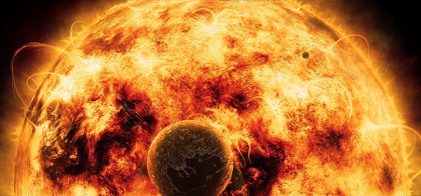
Final Image
And there we have it we have reached the end of this tutorial we have a big amazing star to show off our efforts and we have learned quite a bit of techniques along the way. Remember to spend a good amount of time studying the videos. Thanks for your time and hope to see you on part 2 of this series.