
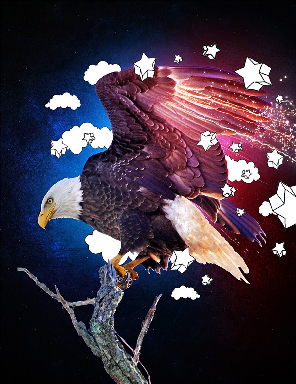
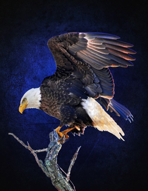
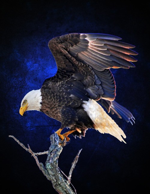
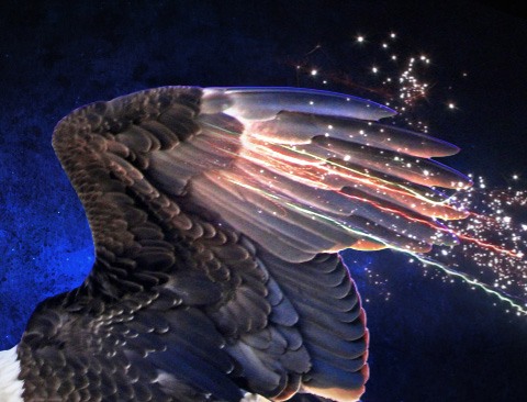
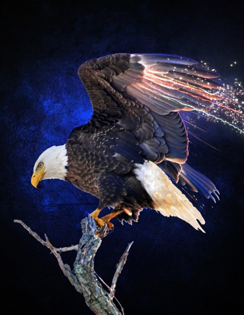
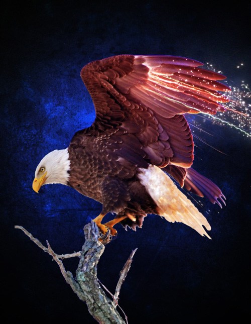
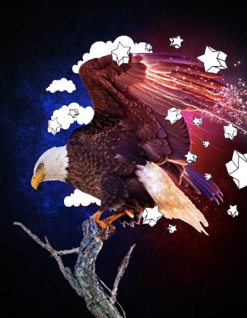
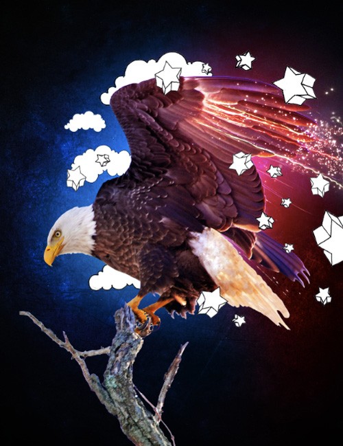
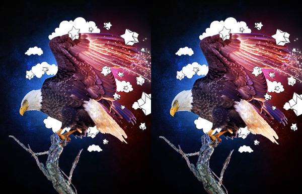
Preview
Tutorial Resources
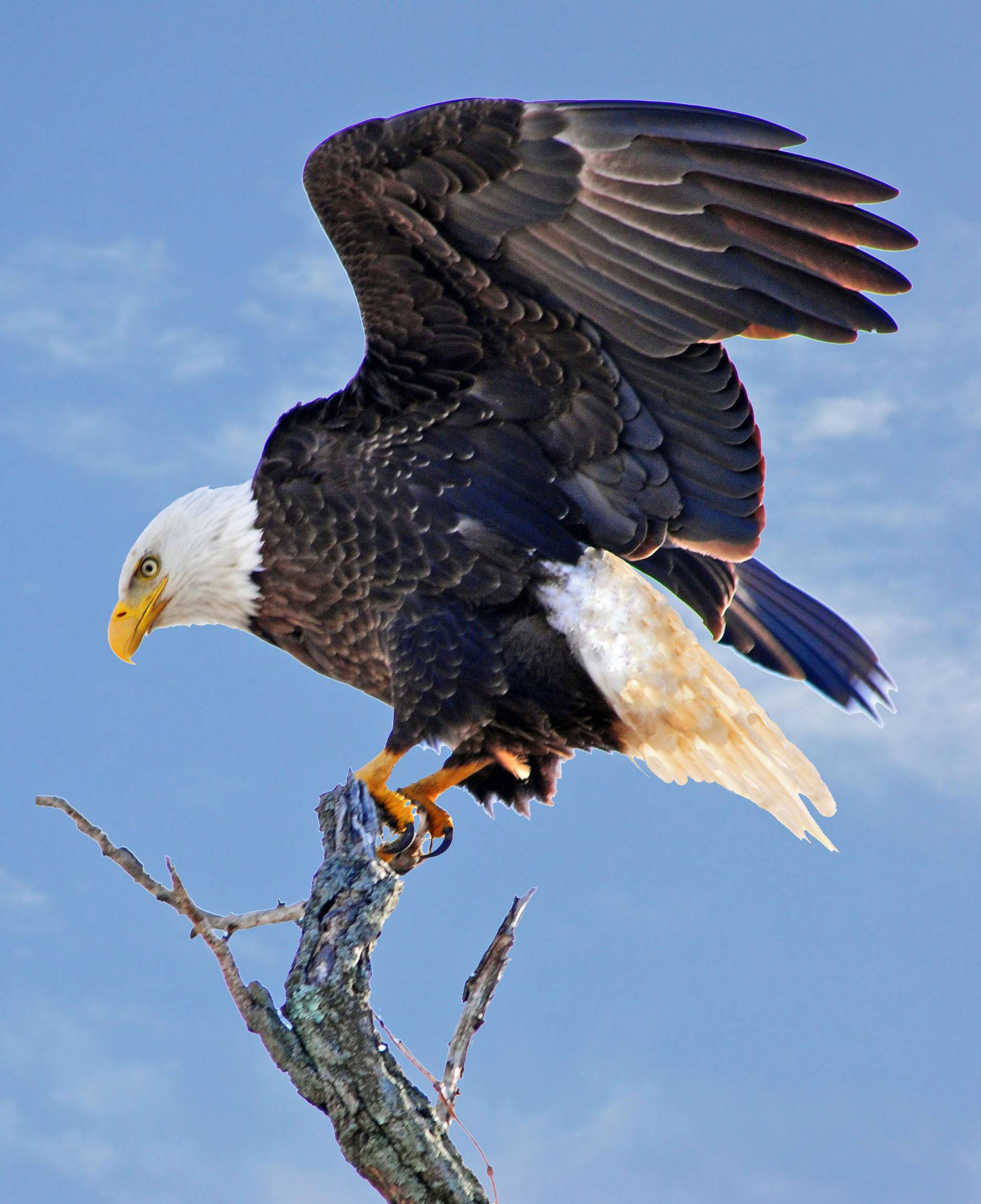
- Stock photo: Eagle by Dennis Ruffe
- Texture: Grunge by Struck Dumb
- Pattern library: Seamless Abstract Nebula Textures by Webtreats ETC
- Stock photo: Fourth of July Fireworks by Bill Fehr
- Stock photo: Independence Day Fireworks 8 by Liz Bogus
- PSD: Clouds
- PSD: Stars
Step 1: Masking the Eagle
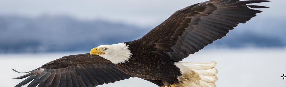
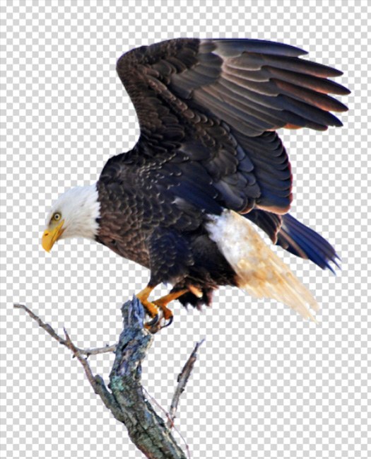
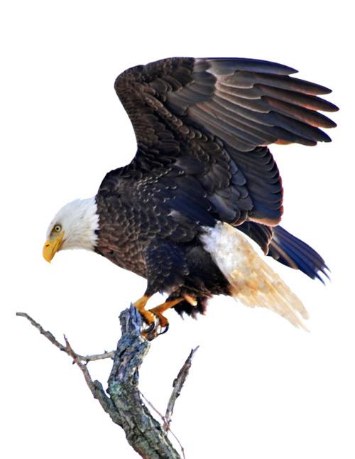
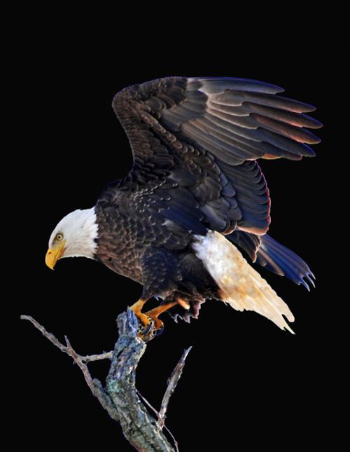
To start things off, in Photoshop, open the image of the eagle, kindly donated by my uncle Dennis Ruffe.
Click on the eagle layer to make sure that it’s highlighted in your Layers Panel, and then press Cmd/Ctrl + J to duplicate the layer.
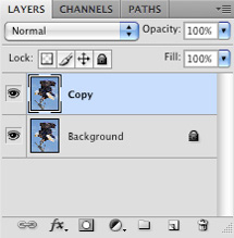
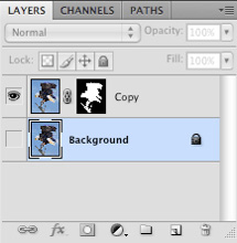
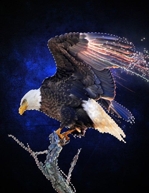
What we’re going to do is mask out the background in order to isolate the eagle and the branch it’s perching on. Turn off the visibility of the original eagle layer. Click on the Add layer mask icon found at the bottom of the Layers Panel to create a mask.
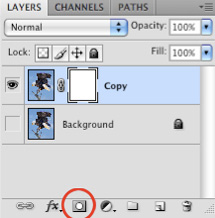
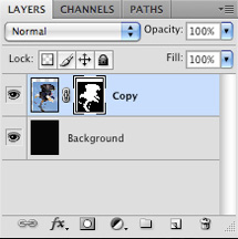
Once you add the layer mask, you will see the layer mask thumbnail added next to the thumbnail of the eagle in the Layers Panel.
You can switch back and forth between the mask and the image on this layer by clicking on their respective thumbnails.
Click on the mask thumbnail right now, just to make sure we’re working on the layer mask. You will notice how there’s a black box around the layer mask thumbnail, indicating that it’s what we’re working on.
Choose the Brush Tool (B) from the Tools Panel, pick a hard, round brush and set your Foreground color to black. Begin to paint in all of the areas that you want to remove.
If you mess up, simply switch your Foreground color to white to bring the masked out area back.
In the Layers Panel, notice that the areas we’re masking out appear as black in the mask thumbnail, while the areas we want to keep are in white.
Take your time with this layer masking.
After masking out the background, your work should look similar to this:
Step 2: Place the Eagle in a New Document
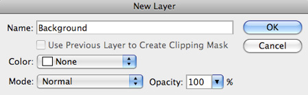
Press Cmd/Ctrl + N to create a new document and make it 8.5″ x 11″ RGB color mode, as shown here:
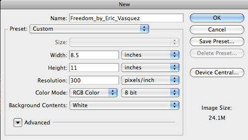
Press Enter to create the document (or just click OK). Switch back to the other document with the eagle and then copy and paste the image over into the new file. You will now have an eagle layer as well as the default Background layer.
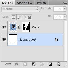
Double-click on the Background layer and the New Layer dialog box will appear.
You can just press Enter or click OK to unlock the Background layer.
Now that layer is unlocked, we can go ahead and modify the layer any way we need to.
With your eagle layer selected, press Cmd/Ctrl + T to activate Free Transform, hold down Shift, and drag outwards from any of the four corners of the transform box to scale up the eagle a bit.
Step 3: Fill the Background
Switch to the Paint Bucket Tool (G) and then choose a dark gray Foreground color (here I’m using #060606).
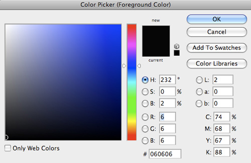
Once you have your color selected, make sure the Background layer is active, then click anywhere on the Background layer to fill it with our deep gray. You will now have something like this:
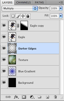
Step 4: Apply the Layer Mask
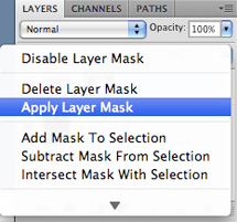
Before we move on, we’re going to commit the layer mask on our eagle (since we won’t be modifying the mask anymore). To do this, we will again make sure that our layer mask thumbnail is selected.
Next, Control-click/right-click on the layer mask thumbnail to reveal a dropdown menu.
From the menu, we want to choose Apply Layer Mask.
Once you apply the mask, you should no longer see the layer mask thumbnail because we have applied it (committed it) to the eagle layer.
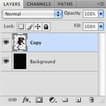
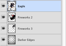
Rename this layer something like “Eagle” just to keep things organized.
Step 5: Enhance the Color of the Eagle
Select the Eagle layer and then press Cmd/Ctrl + J to duplicate the layer.
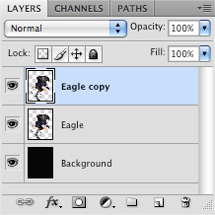
Tip: This is an example of why renaming layers is good; if we hadn’t renamed this layer to “Eagle” in the previous step, we would have “Copy” and “Copy copy” as our layer names, which is something we want to keep from happening. Once we start to add more layers, it will definitely save some time when we hunt down the layer we need, so it’s good to get in the habit of doing this early on in the design process.
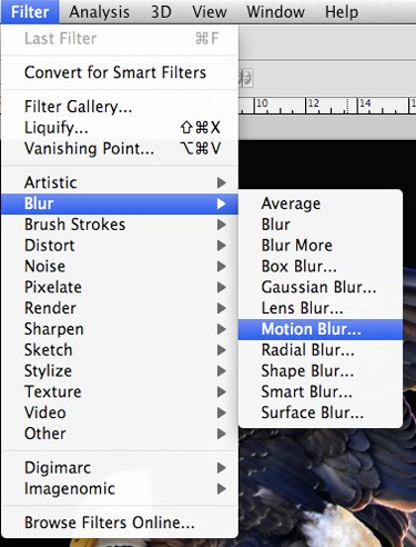
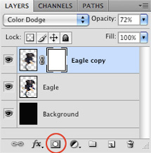
With your duplicate layer selected, we want to go to Filter > Blur > Motion Blur.
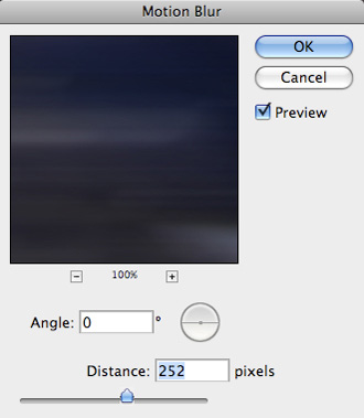
When the Motion Blur dialog box appears, apply the following settings (then press Enter to apply the filter):
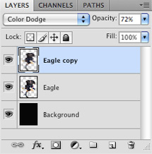
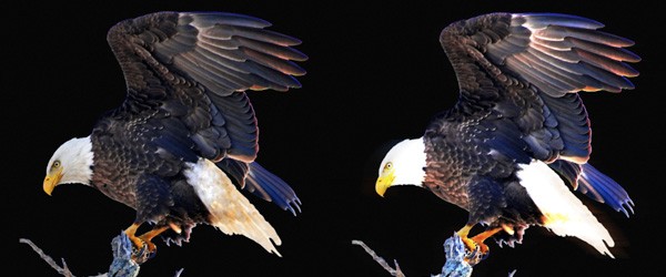
Next, we’re going to change the Blend Mode of this layer to Color Dodge and reduce the layer’s Opacity to about 72%.
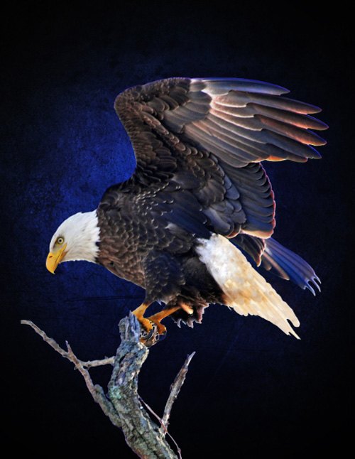
The image below shows the before and after effect on our eagle:
Step 6: Fade Away
Create a layer mask on the “Eagle copy” layer by clicking on the Add layer mask icon at the bottom of the Layers Panel.
After that, switch to the Gradient Tool (G) and use a black-to-white color gradient:
![]()
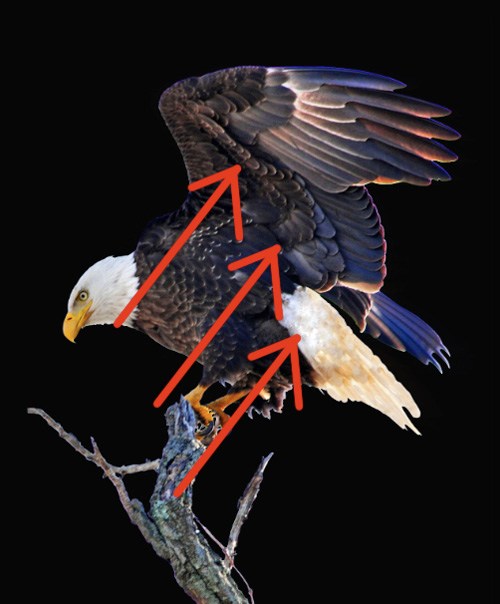
Next, click around the bottom left of the eagle and drag upwards and to the right, along the direction of the wing. Doing this will mask out the majority of the body and lower half of the eagle so that the focus of the effect is on the wing.
Doing this also helps bring some of the detail back into the eagle that was taken away in the previous step, along with adding a punch of color and brightness to the design. You might say we are killing two birds with one stone… okay, never mind, moving on.
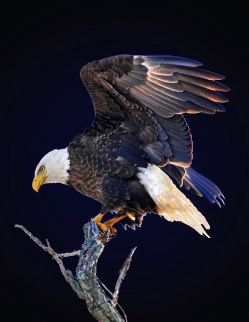
Step 7: Create a Blue Glow
This further enhances the focal point of the piece.
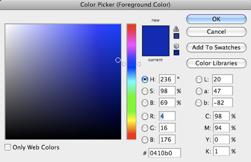
Create a new layer just above the Background layer and choose a vibrant blue color — I’m using #0410B0.
Switch to your Gradient Tool (G) and select a radial gradient that fades from solid blue to transparent.
![]()
Next, click at the center of your image and drag outwards to create your gradient. The gradient should fade from blue into our background color. Once you’re happy with the size and placement of the gradient, reduce the Opacity of the layer to about 24%.
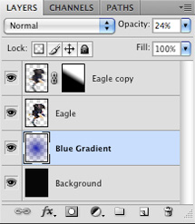
You should now have something like this:
Step 8: Add a Background Texture
Now we can add some texture to our background to give it a more tactile feel.
Download and open this Grunge texture in Photoshop and then bring it into your document. If you want to experiment, also check out some free textures here on Design Instruct.
Make sure that the texture layer is just above the radial gradient layer from the previous step, change its Blend Mode to Color Dodge and reduce the Opacity to about 65%.
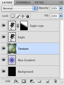
Press Cmd/Ctrl + T to activate Free Transform and then rotate the image 90o so that it fills out the canvas vertically, then just press Enter to apply the transformation.
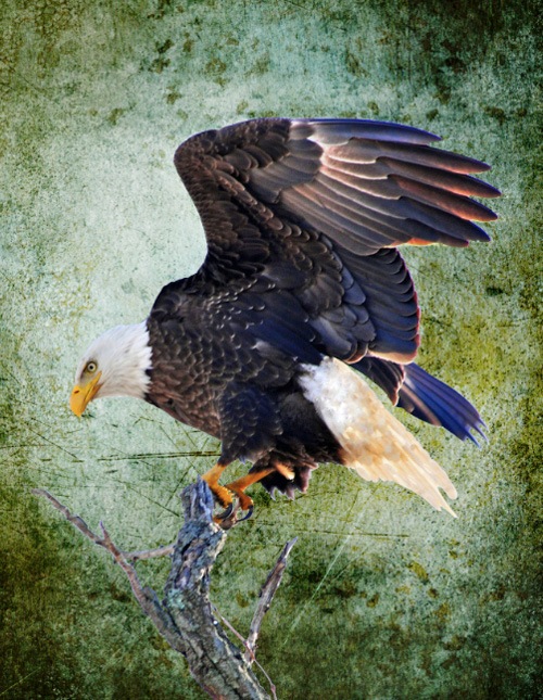
Once the texture is in place and is covering the whole canvas, change the Blend Mode of the layer to Color Dodge and reduce the opacity of the layer to about 65%.
Step 9: Darken Edges of the Canvas
Add a new layer above the texture layer and switch over to your Gradient Tool (G). We want to make sure that we have a radial gradient that fades from black to transparent, similar to what we did earlier when we created our blue radial gradient in Step 7.
This time, however, we want to check off the box that says Reverse to reverse the color gradient.
![]()
Click in the center of the image and drag outwards to create a gradient that will fade to black along the outer edges of the image.
Doing this will add more contrast and depth to the background of our design.
Let’s take a look at what we have so far:
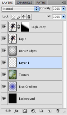
Step 10: Install and Apply a Photoshop Pattern
Next, we’ll install a Photoshop pattern.
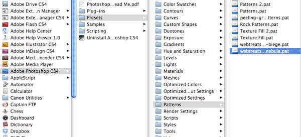
First, download the Seamless Abstract Nebula Textures, which will contain a Photoshop pattern library file (it has a file extension of .pat).
In your hard drive, go to the following folder:
Adobe\Adobe Photoshop CS4\Presets\Patterns
Note: For many of you, this path will be different; you might have installed it somewhere else, you might have a different version of Photoshop, and it will depend on what operating system you use. Just locate the folder where Photoshop is installed, then in it, go to Presets, then Patterns. The Patterns folder contains all of the preset pattern libraries that come with Photoshop, as well as any of the custom Photoshop patterns you’ve made or have already installed.
To learn more about Photoshop patterns, read the Design Instruct guide called Photoshop Patterns: Ultimate Guide.
Extract the Photoshop pattern library file we downloaded to the Patterns folder.
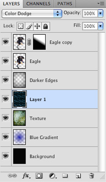
Now that we’ve installed the pattern library, we’re going to apply the pattern. First, we are going to create a new layer just above the texture layer for our pattern.
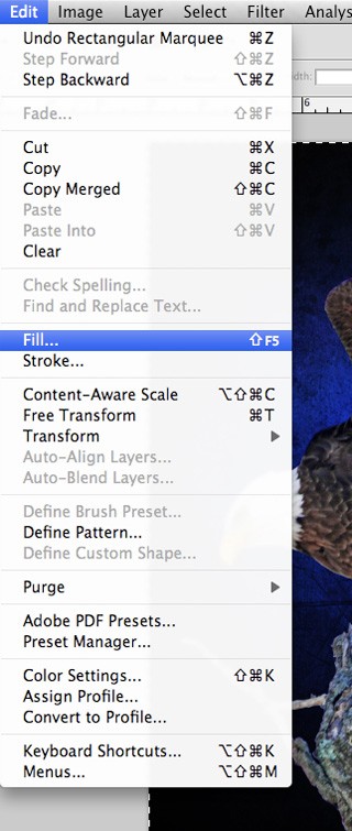
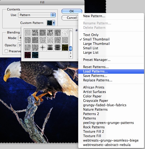
Select your Rectangular Marquee Tool (M) and create a selection around your entire canvas (Cmd/Ctrl + A). Then go to Edit > Fill, which will reveal the Fill dialog window.
Once the dialog window appears, choose Patterns in the Use option dropdown menu.
This will enable the Custom Pattern option right below it. Click on the thumbnail preview on the right of the Custom Pattern option to expand it. Once expanded, click on the small rightward-pointing arrow to reveal more options and commands.
Select Load Patterns and locate the pattern library we installed. Then choose the blue pattern from the list of patterns.
Just press the OK button to apply the pattern, which will fill the canvas with our nice spacey texture.
After filling the layer with the custom pattern, change its Blend Mode to Color Dodge.
This will add more depth and texture to our background. You can see the results by toggling the visibility of the space pattern layer on and off.
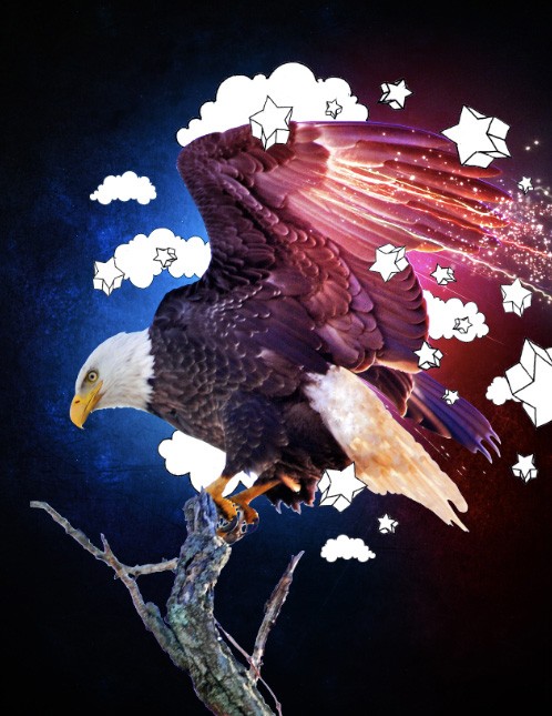
Step 11: Add Sparks to the Eagle’s Wings
Next, open the Fourth of July Fireworks stock image and bring it into your document.
Scale it up using Free Transform (Cmd/Ctrl + T), hold Shift to constrain the proportions.
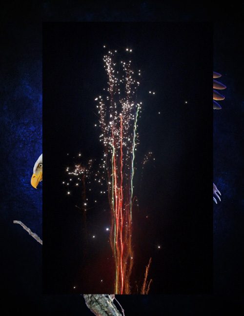
Change the Blend Mode of the image to Screen and rotate it a little bit.
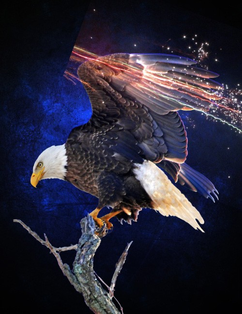
Add a layer mask onto the fireworks image. Mask out parts of it by using a black soft round brush set on a low opacity (between 30-40%).
Use the Move Tool (V) to position the image so that the fireworks follow the direction of the wing. Mask away parts of the sparkles so that it appears as though they are actually flying and emanating from the wing of the eagle.
We want to use a soft brush so that the fade appears to be smooth.
By doing this, we are beginning to see how we can easily incorporate some cool light effects that convey motion and speed in our work.
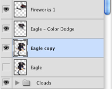
Step 12: Add Some Fireworks
Download and open the Independence Day Fireworks 8 stock image in Photoshop, and then place it into our canvas. We’ll use the same technique from the previous step to incorporate this image into our design. Scale it up using Free Transform (Cmd/Ctrl + T), and then change the layer’s Blend Mode to Screen so that we conceal the darker areas of the stock image.
Below, you’ll see that I’ve placed the fireworks layer beneath the eagle layer, flipped the fireworks and warped it a bit, so that it has a longer streak of lights.
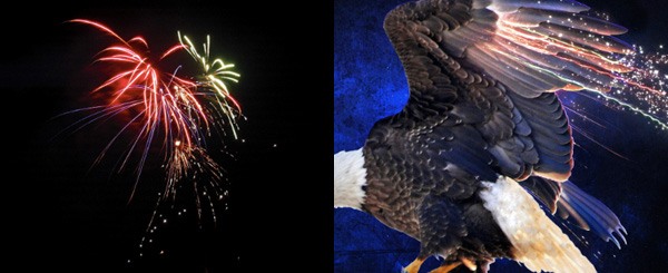
You don’t necessarily have to use the whole part of the image; you can use a layer mask to hide areas of it you don’t like.
Continue this process by experimenting with the size, placement, and shape of the fireworks, but try not to go overboard. If we start placing too many of these lights, they might start to compete with other areas of the image too much.
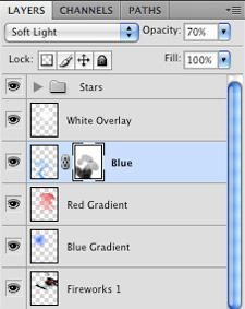
Step 13: Add Some Color to the Eagle
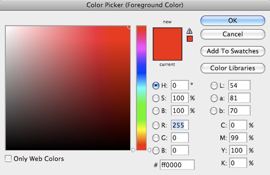
Hold down Cmd/Ctrl and, in the Layers Panel, click on the layer thumbnail of the original eagle layer to create a selection around it.
Keep the selection active, create a new layer at the very top of the layers stack, and change your Foreground color to a bright red (#FF0000).

Choose the Gradient Tool (G) and use a linear gradient that fades from the red color to transparent.
![]()
On the new layer, click-and-hold at the top right of the wing, then drag diagonally towards the left of the eagle to apply the gradient fade.
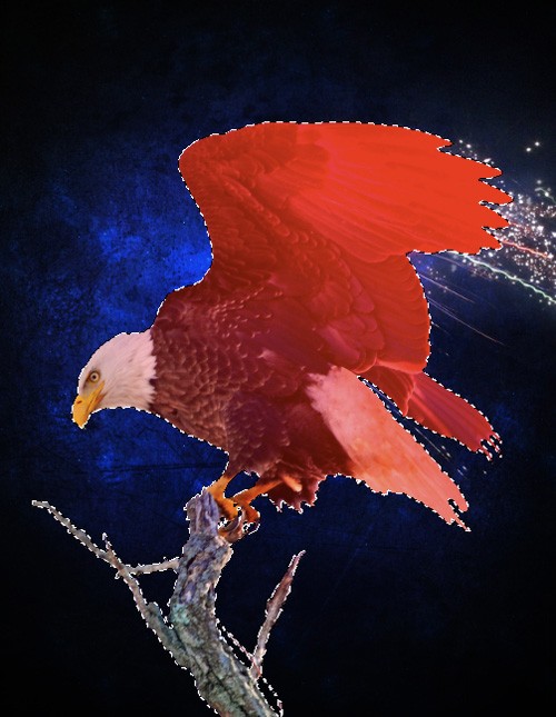
Since we have a marquee selection around the eagle, we are ensuring that the gradient only happens within the selected area.
Change the Blend Mode of the red gradient layer to Soft Light and reduce the Opacity to about 85%.
Step 14: Add Some Hand-Drawn Clouds
Download and open the Clouds PSD file.
Using your Rectangular Marquee Tool (M), quickly make a selection around one of the clouds.
Press Cmd/Ctrl + J to duplicate your selection onto a new layer and drag it over to your composition.
Use your Magic Wand Tool (W) to select an area outside of the cloud to remove the excess white background, then just press Delete.
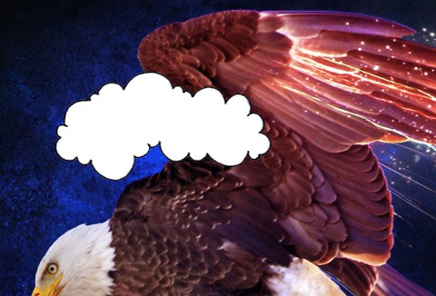
At this point, have some fun and play around with sizing and placement of the cloud before continuing to add more cloud shapes to the design.
I have placed a few behind the eagle and also have some clouds overlap the eagle to add depth.
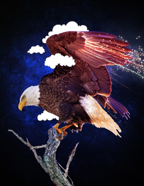
Adding hand-drawn elements or custom-made vectors are great ways to make the image more interesting and personalized. Feel free to sketch, scan and incorporate your own hand-drawn elements.
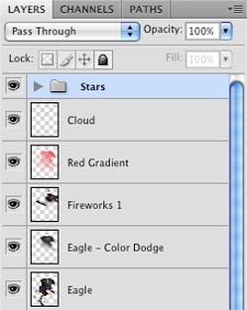
Step 15: Add Some Hand-Drawn Stars
Next, we are going to download and open the Stars PSD file. Using the same method as in the previous step, start by making a selection around a star and then pressing Cmd/Ctrl + J to duplicate the selection onto a new layer.
From there, you can drag the layer over to your main document and get rid of any unwanted white background by selecting it with the Magic Wand Tool (W) and pressing Delete.
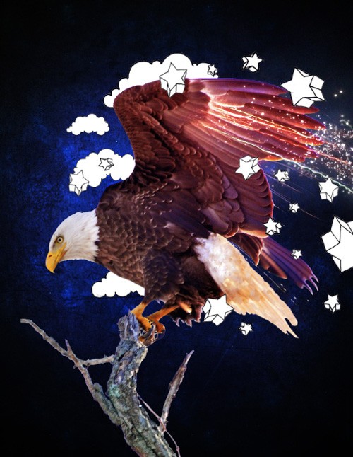
Try to scatter the stars around a bit, using various sizes and directions to make them appear more random. Once you have a composition that you are happy with, select all the star layers in the Layers Panel.
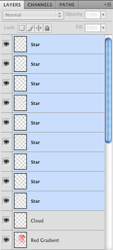
With all your star layers selected, press Cmd/Ctrl + G to put them in a layer group. By putting all of the layers into a group, it helps keep some order in the document.
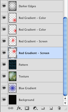
Step 16: Add Spots of Red Color
Create a new layer above the pattern layer.
Next, choose a bright red color (#FF0000) as your Foreground color.
Switch to your Gradient Tool (G) and set it up to be a radial gradient that fades from our red color to transparent.
![]()
Click in the center of your canvas and drag outwards to create the gradient. Afterwards, experiment with different layer blending modes to create some interesting results.
Below, you can see that I’m using four radial gradient layers; two of them are set to Screen blend mode and the other two are set to Color.
All four of these gradients will be behind the eagle and so we want to position them in such a way that they appear to be underneath the wing. Remember that whenever we have a light source, some of that color will also affect the color of the shadows.
Step 17: Add Hints of Blue to Balance the Composition
Create another layer above the red gradients.
Switch your Foreground color to a light shade of blue (I’m using #0072FF). Using the same gradient settings as the previous step, we want to establish some balance by placing some lighter blues on the left side of the image, behind the eagle.
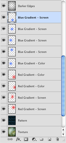
Once again, we will be changing the Blend Mode of these colors to Screen and Color before we position them in the composition accordingly. You can see how doing this brightens up the left side of the scene more and enhances the overall composition.
Step 18: Work on the Composition’s Lighting
Next, we will add more vibrancy and brightness to the light coming from the wing.
To do this we will need to create a new layer just below our stars layers. Now we will select a white as our Foreground color and then switch back to our Gradient Tool (G).
We still want to use the same settings that we have been using in the previous two steps so you shouldn’t have to change that at this point.
Click and drag outwards from the center of the canvas to create a white gradient. After that, we want to reduce the Opacity of the layer to about 72% and change the Blend Mode to Overlay.
The image below shows the before and after of the lighting effect.
You can see how doing this helps bring in some more detail in some of the feathers as well.

Step 19: Add Some Blue Color
Next, hold down Cmd/Ctrl, and then click on the thumbnail image of the eagle layer to load a selection around it.
While your selection is still active, go ahead and create a new layer and then place it below the white overlay layer from the previous step, as shown here:
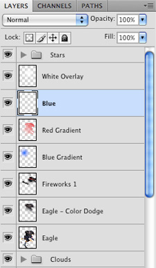
Switch to your Gradient Tool (G) and choose a bright blue color (#01A6FB).
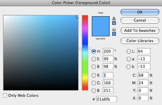
Check the settings for your gradient and make sure you are using a linear gradient that fades from our blue color to transparent. Also, make sure that the Reverse option is not checked off.
![]()
Now we want to start at the bottom left of the canvas and drag upwards and to the right so that we mostly get our color on the bottom portion of the image.
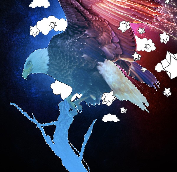
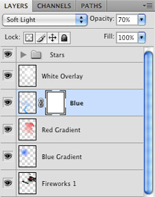
Step 20: Layer Masking
What we want to do next is change the Blend Mode of this layer to Soft Light and reduce the Opacity to about 70%. Once you have done that, add a layer mask to this layer, just like we did earlier with some of our other layers.
Switch to your Brush Tool (B) and use a low opacity (20-30%) soft round brush.
I’m using a brush size of 500px and also have a solid black color selected.
Tip: When using a brush, use your left square bracket ([) and right square bracket (]) keys on your keyboard to decrease or increase the size of your brush. If you do this while holding Shift, you will be changing the hardness of your brush — the left square bracket makes it softer, while the right square bracket creates a hard-edged brush. You can also vary the opacity of your brush simply by pressing any of the numbers 1-0 on your keyboard.
Shortcuts like this will save you a lot of time.
![]()
Make sure that you have your layer mask in the Layers Panel, and then begin to mask out different areas of color to blend it with the image.
Notice how I’ve masked out some of the color around the head and beak of the eagle as well as the talons. Also, I’ve almost completely removed the color from the tree branch except for a few spots to create some reflections of blue.

Play around with this and continue to use your low opacity brush. This will create more gradual fades between the color and the image below.
Step 21: Burn Baby Burn!
Next, make a duplicate of the eagle layer by pressing Cmd/Ctrl + J with the layer selected, and then turn off the visibility of the original layer.
Choose the Burn Tool, lower the Opacity to about 20-30% and use a large soft brush like we used in the previous step.
Also, make sure that the Burn Tool settings are set to Shadows.
![]()
On your duplicate eagle layer, begin to brush in some of the darker areas of the feathers and the tree branch to create some deeper shadows that will help create more contrast in the scene.
The trick when using the Burn Tool is to try and keep it subtle. You don’t want to overuse this tool. But when used sparingly, it will add a very nice professional finish to your images.
Like photographers who touch up their work in Photoshop, I tend to use these tools quite a lot when retouching photos, but subtlety is the goal here.
You can also see the difference this has by turning the visibility of your duplicated eagle layer on or off as long as the visibility of the original layer below it is on.
Step 22: Dodge Tool
Next, create a copy of our newly burned layer and rename the layer copy to “Dodged”. I am doing this because it makes it easier to go back to the previous state if we need to.
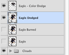
Switch to the Dodge Tool and set it to Highlights. Again, use a low opacity, soft round brush for this step.
![]()
Zoom in and brush some of the lighter areas where you want to brighten and bring some detail back into the image. This can help create a more dramatic image and if you compare the before and after images below, you can notice a difference — a subtle difference, but it does help to create more impact.
You can also turn on the original eagle layer and then toggle the visibility of the dodge layer to see the difference.
Once you are satisfied with the results of the dodging, be sure to save your work because we are going to flatten the image and sharpen it to bring some more crispness to the design.
Step 23: Looking Sharp
We’re now at the final step.
Select all the layers in the Layers Panel.
With all of your layers selected, go to Filter > Sharpen > Unsharp Mask.
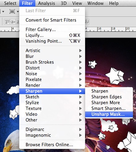
Once the dialog box appears, apply the following settings.
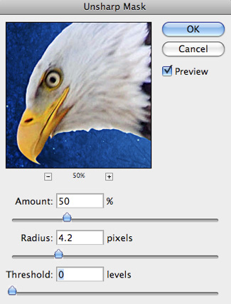
Now we’ve got even more crispness and clarity in our scene.

Tutorial Summary
We have now reached the conclusion of this design tutorial and I thank you for following along with me. Hopefully you have learned some new tips and timesavers along the way.
Until next time, happy Photoshopping!
Download Source Files
- eagle_handdrawn_composition (ZIP, 106.00 MB)
-
 Trevin serves as the VP of Marketing at WebFX. He has worked on over 450 marketing campaigns and has been building websites for over 25 years. His work has been featured by Search Engine Land, USA Today, Fast Company and Inc.
 -

WebFX is a full-service marketing agency with 1,100+ client reviews and a 4.9-star rating on Clutch! Find out how our expert team and revenue-accelerating tech can drive results for you! Learn more
Make estimating web design costs easy
Website design costs can be tricky to nail down. Get an instant estimate for a custom web design with our free website design cost calculator!
Try Our Free Web Design Cost Calculator
Table of Contents
- Preview
- Tutorial Resources
- Step 1: Masking the Eagle
- Step 2: Place the Eagle in a New Document
- Step 3: Fill the Background
- Step 4: Apply the Layer Mask
- Step 5: Enhance the Color of the Eagle
- Step 6: Fade Away
- Step 7: Create a Blue Glow
- Step 8: Add a Background Texture
- Step 9: Darken Edges of the Canvas
- Step 10: Install and Apply a Photoshop Pattern
- Step 11: Add Sparks to the Eagle’s Wings
- Step 12: Add Some Fireworks
- Step 13: Add Some Color to the Eagle
- Step 14: Add Some Hand-Drawn Clouds
- Step 15: Add Some Hand-Drawn Stars
- Step 16: Add Spots of Red Color
- Step 17: Add Hints of Blue to Balance the Composition
- Step 18: Work on the Composition’s Lighting
- Step 19: Add Some Blue Color
- Step 20: Layer Masking
- Step 21: Burn Baby Burn!
- Step 22: Dodge Tool
- Step 23: Looking Sharp
- Tutorial Summary
- Download Source Files
Share this article


Web Design Calculator
Use our free tool to get a free, instant quote in under 60 seconds.
View Web Design CalculatorMake estimating web design costs easy
Website design costs can be tricky to nail down. Get an instant estimate for a custom web design with our free website design cost calculator!
Try Our Free Web Design Cost Calculator


