

A good friend and amazing artist Bram Vanhaeren and I decided to collaborate on an illustration to then create a tutorial for all the readers at Psdtuts+. We came up with a cool illustration that incorporates patterns, coloring, as well as 3D shapes. The most important thing about this is that it is all extremely simple to create so it shouldn't be that difficult for anybody. There are a lot of new techniques here that I guarantee you'll be using, so check this one out!
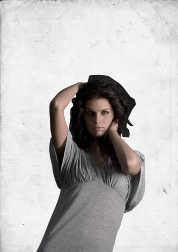
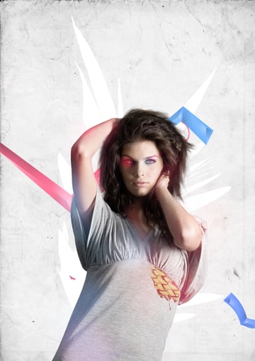
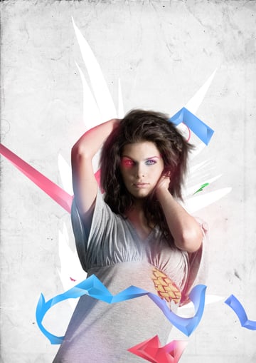
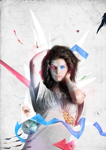
Final Image Preview
Take a look at the image we'll be creating.


Introduction
This tutorial is simple to follow and will give you some great techniques and results. We'll be using simple techniques to create elaborate 3D shapes to decorate our image with. There will also be some simple coloring techniques as well as some patterns used.
To start yourself off you will need to find 2 essential stock photographs to use in this illustration. The first thing you will need to find is a good background, for these types of illustrations a paper texture, or a concrete one should work well.
You want something simple that will not overpower what you will have going on over it. We were given permission from Bashcorpo to use one of his amazing stocks located here on the DeviantArt page. So feel free to look through the portfolio and grab one of the many amazing background textures.
The final step in preparation is to get the main stock images you will be using. Bram and I both chose this stock from SXC. The reason we chose this stock is because you have enough of the body visible in the picture, the face
isn't covered and it will make for an overall attractive picture once everything is added over it. So make your pick, try to find a stock that fits the criteria, something high resolution so it doesn't distort when you enlarge it, and something you find attractive in the eyes. After you have all of that, drag it into Photoshop so we can begin.
Step 1
Now let's open up Photoshop, we always work with an A3 300 dpi size because you never know if a magazine wants high-res files and of course you want to print your own work out, and for all of that 300 dpi is perfect. Now before you start with the artwork you should make some groups to put your layers in.
Group 1 will be named "Background," Group 2 will be the "Model" and you can add groups like "Color" as you go along. I also use groups called "PLAY," here where I play with patterns and add little details to make it look better. Below you can see how the groups look before even starting the illustration.

Step 2
After you make the groups you should always start with the background first, because it is hard work with a plain white background. I use paper textures a lot, you can find a stock like this by searching on SXC or DeviantArt. If your paper texture was not originally white like ours, then you can go ahead and desaturate it or use hue/saturation and then saturate it to about -80, so there is still this slight orange tint on it.
Experiment with it as much as you can until you find something that is suitable for you, Command + U will bring up the Hue/Saturation screen, and Command + Shift + U will just desaturate the whole layer. After that you can also brighten the background a little bit by playing with the Lightness bar on Hue/Saturation.
After that I added the stock we picked onto the background and used the Pen Tool to cut away the background. If you are using a model with a lot of hair, then do not worry, just avoid cutting it out for now and I will show you how to solve that problem later. As you can see it was too tedious to cut out our model's hair as well so we left it alone for now. So far the piece is looking like the image below.

Step 3
Now I adjust the colors of my model because she is looking a bit too dark. First I try to make her brighter by using brightness/contrast - Brightness +18 in my case. Every stock is different so you have to feel it out yourself and decide when you think it's bright enough.
The next technique that we use a lot is again adjusting her with Hue/Saturation and Saturate by -20. Why, because your background is also saturated. Another good thing to do is to add little
details throughout creating the whole piece. One thing I added is a quick drawn path with the lasso Tool over the background and under the model. It's a small thing, but it will bring the piece
together at the end.

Step 4
Now we will address the issue with the hair. There are two different methods to dealing with this problem and both of them are a lot more
efficient than going in with the pen tool and sitting there cutting around every strand of hair.
Method 1 is for the users who have the pleasure of using a tablet, if you do then first download these amazing brushes created by the extraordinary painter Daniel Luvisi. In this pack you will find a hair brush, the settings are already in place so all you have to do is make a new layer above your model and call it "Hair."
After that zoom in a fair amount and get to the point of the stock where you have the background still left. From there get the Eye Dropper tool and take samples of the color the hair is in that area. Once you have done that just keep stroking away with the great hair brush. You should get into an easy rhythm of Eye Dropper then Brush Tool, after a while and a few layers you should have some very realistic hair. Be creative, also use different colors and try to mimic the original hair color. If you have any of the original background sticking out you can just erase it.
Method 2 is very similar but for those users who do not have a tablet to use. This will take a bit longer though. First off make a new layer entitled "Hair" over the model and grab the Eye Dropper tool. Take a sample of the hair's main color and then grab your Pen tool. Find a 3px hard brush and select it then with the Pen tool map out some simple strands of hair all around. After that right-click over it and select Stroke, with Pen Pressure selected. Repeat the process with a few different colors and brush sizes and you should be good.
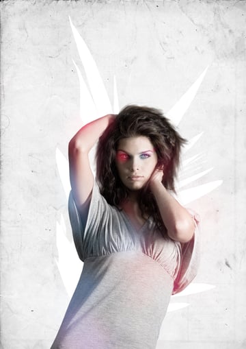
Now it's starts getting colorful. Our hair is brushed and we can finally start playing around with colors and patterns. First you take your basic soft round brush tool, now you choose some fresh and vibrant colors like Pink, Blue and yellow, all your choice. Then brush around the model, remember to experiment. I always try to add the brushing over focal points like the neck of the girl, arms, around the eye a little bit and her hips of course.
Use as many layers as you want with your brushes and add them to the Group "Front Color" group. The image below is how the work looks like on a black background, just so you can see the type of brushes used as well as colors.

Step 5
Now we will change the blend options for the color layers to Screen or Lighten, this part you have to check out yourself to see what looks the best in your opinion. Now we have a little color in our artwork, so far it is looking good. You can also see how the hair looks after it was painted, still very realistic and there was no need to spend a lot of time cutting it out.

Step 6
Now we will be adding one more stock to give some texture to the illustration as well as to color up her gray top. First we search for a golden object that is large enough where we can cut out a part of it to fill up a decent portion of her gray top.
We found this photograph taken of a golden belt. Now take the Lasso Tool and put the feather setting on, this is very important. Now take a random selection with it that would fit over her top. We will position this part on the top-right corner of her shirt.


Step 7
Now we place it in the top-right corner of her shirt and select the whole selection again, then add a new layer and brush with some soft brushes like last time. You can set them to either Screen or Lighten, whichever looks best to you. Below is what we had after this step was completed.


Step 8
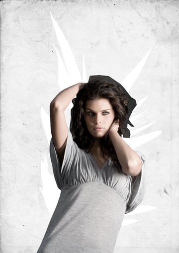
Now we will begin making some abstract 3D shapes using the Polygonal Tool with the Feather setting on again. You should start a new group called
Abstract Objects and leave it over your background and under your model stock.
Take a random selection with your Polygonal Tool and fill it with a funky color. In this case Pink was used. This whole illustration is going to be vibrant and happy so pick colors that represent that.


Step 9
Now we want to add shadows so it becomes a 3D abstract object. You are going to want to make triangular and rectangular selections with your Polygonal Tool. Make sure they follow the same edges as your original shape. After you have a selection down, slightly use the Soft Round Brush with the colors Black and White to cast shadows and highlights on your shape. You can even lower the Opacity of your brush so the shadows and highlights are softer.
Here is where you can be original, look at what we have and use that as a basis to make your own wacky 3D shapes, play around with where the shadows go and highlights so your object gets that 3D look to it. This will take your illustration to a whole other level by taking bland 2D shapes and making them pop more and come to life. All it takes is a few
careful selections and a couple of brushes.


Step 10
After adding all the shadows and highlights this is what we have as a final product, first try to replicate what we got and once you have gotten the hang of it try to create your own versions of them.


Step 11
Now take your 3D shape and duplicate it once. After you have done that just hide that one for now. Go back to your original and if needed press Command + T to either rotate it or enlarge/minimize its size.
Once you have it in place go back to that hidden layer and unhide it. Now change its color by using Color Balance, or by just messing with the Hue in Hue/Saturation. After you have a second shape just resize it and rotate it. If it needs to be rotated, then place it somewhere behind the model.
Duplicate the duplicated 3D layer that you just changed the color of. Now proceed to distort it, so go to Distort-Twirl, and here you have to play with the settings. You can go with an angle of -50 to -250 or 50 to 250. So once you have decided on what you want proceed to Twirl it, and then set it somewhere on the canvas. Below is what we have so far at this point.

Step 12
Ok we're on the right track now. We have made our first abstract 3D object, now let's make a second one. This one will be slightly more complicated then our last because we will be placing it over the model so we want everyone to see all the detail in it. This one will be a bit longer in shape and it will flow according to her body and go around her belly.
Below I drew out a simple shape just to show the flow of the object, note this isn't the the shape we will be using. This is just something to show you how it will flow throughout her body. Whatever your stock looks like try to make a shape that has the same type of flow to it, going over the body and then tucking back under it.

Step 13
Now if you do not remember how to make the 3D objects scroll back up and read the instructions again from Step 9 and Step 10. The whole process is very easy. You just have to practice a lot. It also doesn't hurt to be creative and think outside the norm. With all that you will master the technique in no time. Below is the shape we created, it flows almost as we want it to. In the next step we will make an adjustment to fix one of the edges.


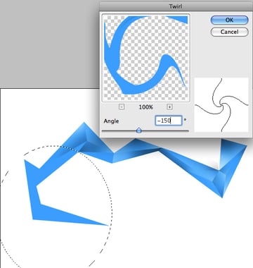
Step 14
Now our current shape is a bit rough looking with all the sharp edges, so to fix that and make it more rounded we will use the Twirl technique again. So first thing to do is select a part of the shape with the Elliptical Marquee Tool and use a feather of 20, then while you have the selection go to Distort > Twirl set an angle of -150. Depending on your desired flow you can mess around with the settings. Just don't let it get too out of control.

Step 15
Do it again for the opposite side of our object with an angle of 40. Now we should have an 3D object that looks like the image below.


Step 16
Now we can perfectly put it around our model. If it is too long or too short go ahead and use Transform, to fix it. To add to the realism of it, go ahead and use a soft brush with the color black to go over the edges to cast shadows from the models body. This is what we have so far.

Step 17
To fill in a little bit more space go ahead and experiment with some more 3D shapes. Here we made a small red colored 3D shape and put it over the model. You don't want all your shapes to have the same basic format so try to change it up. As you can see below this one is layered. Even though its different, the exact same simple techniques were used.

Step 18
Make an octagonal selection by using the Polygon Tool and then by choosing 8 sides. Make it a medium sized shape and then just leave it there. The color does not matter at this point. Also hide it as well for now.


Step 19
Now make a new layer over the hidden octagon shape, then do Image > Apply Image. Once you have done that right-click on that layer and click Create Clipping Mask. Unhide the Octagon and then go back to the Applied Image. Use the Move tool to move it around until you get a nice piece of clothing fully inside the octagon shape. After that merge the two layers by pressing Command + E. Once you have done that you can use the Lasso tool to select pieces of the octagon and darken them as well as lighten them with Hue/Saturation.


Step 20
Add some colors with the soft round brush, for example we added the color green onto it. You can then leave it alone or set to Screen/Lighten. Whatever looks best. Then use your Polygonal tool to select shapes inside the octagon and then darken or highlight them with a simple round brush. You are pretty much doing the same technique as the 3D objects, but this time its on a textured surface so its a bit harder. The final result is below.


Step 21
Ok now back to our model. We are going to add our first pattern. I opened up a new document and took the Pen tool, then I just filled the whole thing out with a simple Zebra print. If you are not able to freehand an animal print go ahead and find a stock of a print and use the Pen tool to trace it.
Once I had the print I placed it onto our illustration and then put it over our models neck. I then used the Pen tool again to trace the zebra print so it fits directly over her neck and doesn't go anywhere else.
At this point you can set it to Screen. This will then just leave the black print. If this does not satisfy you then you can always grab the Pen tool again and trace out her neck and make a selection. Once the selection is made go to the original model layer and lower the saturation on her skin. This will give the exact effect of zebra skin. But the decision is all yours to make. This is what it will look like.


Step 22
To finish off this piece we will start adding details! First thing to do is make here face drip. This is very easy to do. Go and make a dripping selection with the Pen tool that goes around the bottom of the models face. You can then fill it with any color, in this case we chose white. You can even lower the opacity as well. After that erase the side of the shape with a soft brush to give it kind of a fade. You should have something similar to the image below now.


Step 23
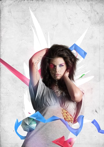
To make this even better, we will use our awesome Lasso tool and select our model layer. Now the next step an important part so make sure you do it until it looks perfect. What you should do is use the Lasso tool with a feather of 0 and draw a weird circular shape around the side of her face. It could be the whole side or it could just be a small portion. You decide on that.

Step 24
Now when we have this selection, Go to Image > Adjustments > Desaturate. Then while it is still selected Brighten or Darken it with Brightness/Contrast, so it stands out more. Do this on her arms too and anywhere else you see fit. Below is my result.


Step 25
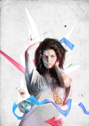
There is still to much negative space in this piece. So here are some tricks to fill up that dead space with something more appealing. You can put some body parts around her, like an eye flowing around, or a nose. I took the lips, nose, and right eye. I cut them out from the duplicated model layer and place them around the piece. Mess around with the positions until you find where it fits best. I also brightened up a few of them. This is the outcome so far.


Step 26
Now you can play with some fun concepts. I took a screenshot of some Photoshop icons and placed the zoom tool behind the model and around the floating eye. Note you do not have to do exactly this, but try to think of ways to fill the space with creative things.

Step 27
Now we add the final small details to polish our illustration. First off when you have a very light piece like we do now it is always good to add a little bit of darkness to it so your eyes don't get caught up in the light. So we will make a new layer and with the Pen tool and create a small dark shape to put anywhere in the piece. We put it in the corner.
After doing that we move on to some more details, you can add accessories on your model. Using the Pen tool you can trace out an armband to put on your model. You may also use some subtle brushes to decorate the back. And finally if you feel the need to, you can make your own small pattern using very simple shapes like triangles, and circles to further decorate your illustration. Just remember not to make it too busy.

Final Result
Have fun decorating your own model to create a stylish, colorful illustration using patterns and shapes.


