

 In this easy to follow web design tutorial, you will learn how to construct a beautiful, sleek, and professional-level weblog design using Adobe Photoshop that you can later use for your very own blog theme.
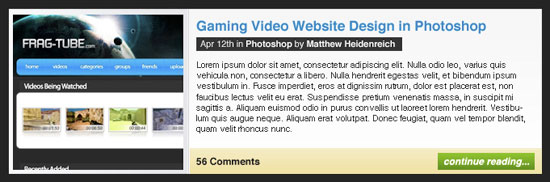
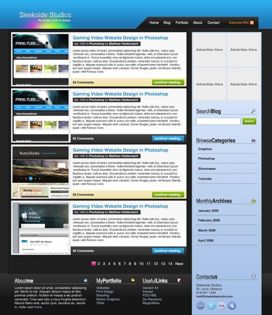
Final Result
You can see what we’ll be making. Be sure to click on it to see the full-scale version of the blog layout. 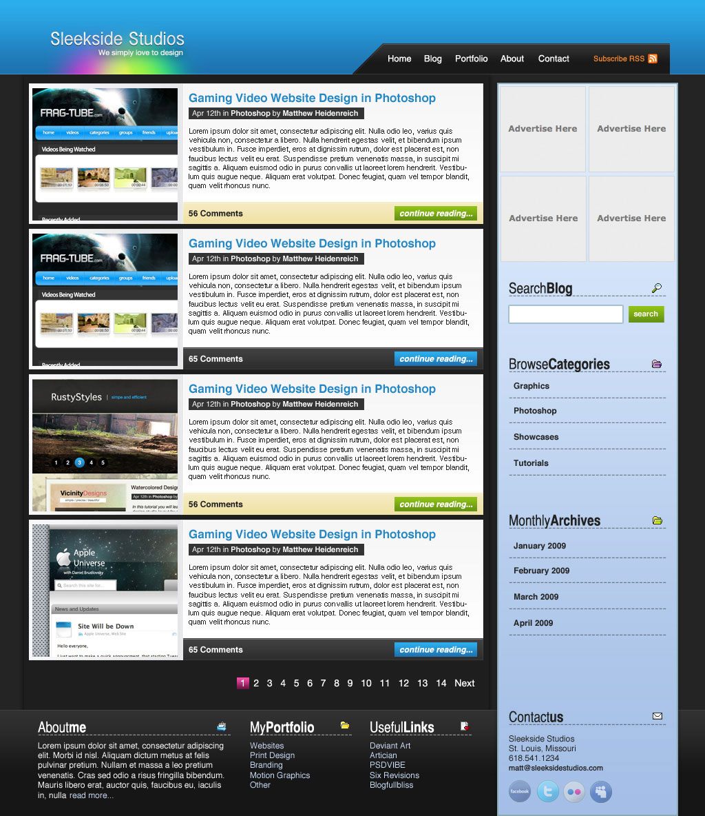
Setting up the Photoshop document
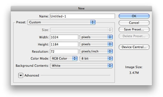
1 Create a new Photoshop document, File > New (Ctrl + N), with a canvas dimension of 1024px by 1184px.
 2 Fill your Background layer using Edit > Fill (Shift + F5) with the color #252424.
Creating the layout’s Header
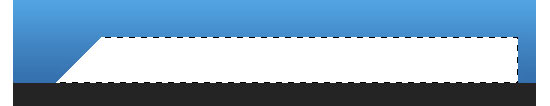
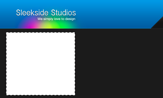
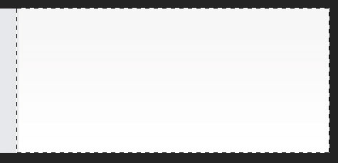
3 We’re going to create the layout’s Header section first. On a new layer, create a rectangular selection at the top of the canvas using the Rectangular Marquee Tool (M).
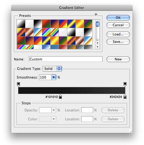
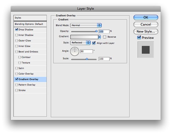
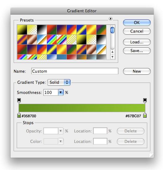
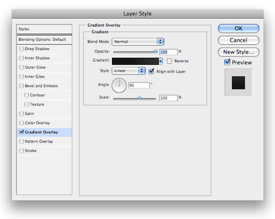
Use the following figure as a guideline on how to create this selection. 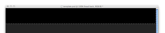 4 Fill the rectangular selection using Edit > Fill (Shift + F5); use a black fill color #000000. 5 To spice things up a bit, we want to add a Gradient Overlay.
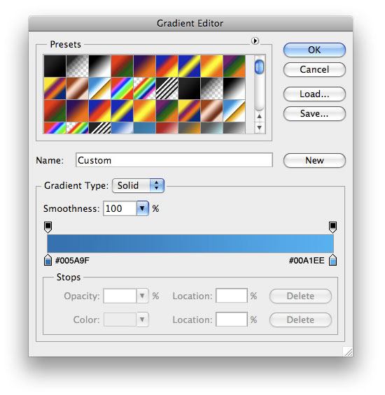
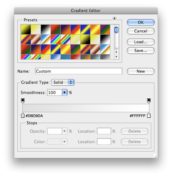
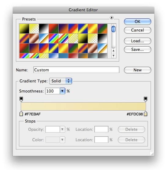
Go to your Layers Panel, right-click your newly created layer, choose Blending Options, and Add a Gradient Overlay layer style using the settings below. 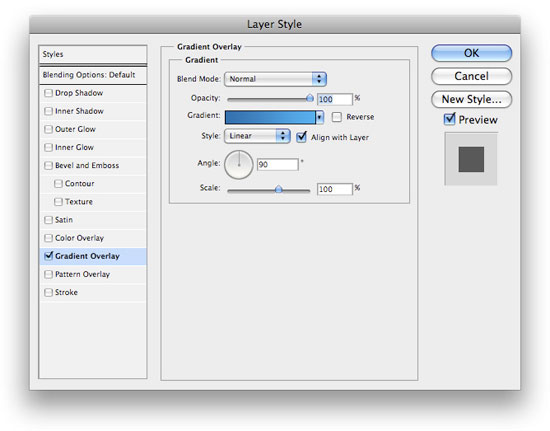
Creating the layout’s navigation menu
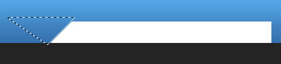
6 Now, we want to work on our navigational menu. Using your Rectangle Marquee Tool (M) again to make a selection similar to the following figure, and then fill it with white (#FFFFFF).  7 In the Tools Panel, choose the Polygonal Lasso Tool and make a selection similar to the following figure, and then choose Edit > Clear to delete the area beneath the lasso selection.
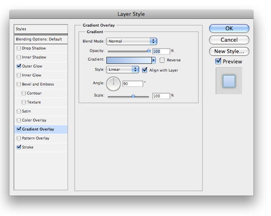
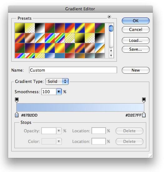
 8 We don’t just want this to stay white, so let’s add a Gradient Overlay layer style onto this layer.
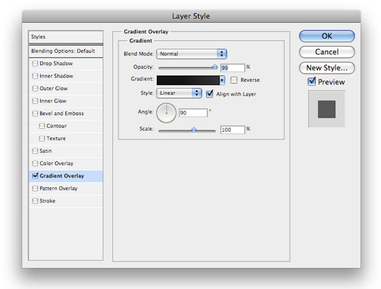
 Your navigation menu should now look like this:
  9 Next, in the Layers Panel, Ctrl + click on the layer’s thumbnail to make a selection around the navigation menu background. Create a new layer and fill the selection with a white color, #FFFFFF.
 10 While still selected, use your down arrow key to nudge your selection down, and then choose Edit > Clear. Then, deselect your current selection (Ctrl + D) and nudge your layer down another 1px using the Move Tool (V). It will look something like this:
  11 Change your layer’s Blending Mode to Soft Light and lower the opacity to 58%. Now, your navigation will look something like the figure below.
 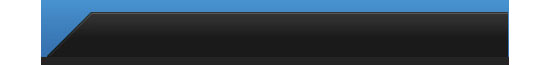 12 All that is left for the navigation is to add some text for links. I used Helvetica with a white forecolor (#FFFFFF) for all the navigation links.
For the “Subscribe RSS” link, I used an orange color (#ED832E). I then added a nice little feed icon next to it from Feed Icons that you can download and use for free (see the Feed Icon Guidelines on their site for more detail). 
Making the layout’s logo
13 Lets move onto our logo now. We want to make the glowing colors behind our text first. Create a new layer and, using your Elliptical Marquee Tool with it’s Feather option set at 18px, make a selection similar to the following and fill it with a pinkish color (#DA4D89). Change this layer’s Blend Mode to Vivid Light.
 14 Create two more layers using the same technique, but change the fill color to green (#06FA05) and yellow (#FEFB03) and Linear Light for their layer blend modes. As far as layer ordering, make the pink on the bottom, the green in the middle, and the yellow on top and move them around using the Move Tool (V) until you get something like the following figure.
 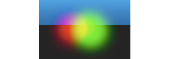 15 What we want to do now is group our glows together. Select those three layers, and then hit Ctrl + G to group them into a folder. Then make a selection similar to the following figure.
 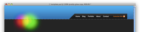 16 With the selection still active, add a layer mask by clicking on the Add a layer mask icon at the bottom of your Layers Panel.
 What you should end up with now is something like this:
 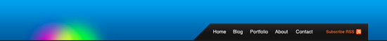 17 Now, we just need to add the text for our logo. The font I used for the name is InaiMathi, and for the tagline, I used Helvetica Neue (which you can see in action on the Six Revisions logo). Lay it out something like the following figure.
 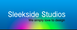 18 Now, add a Drop Shadow and Gradient Overlay layer style onto your “Sleekside Studio’s” (or whatever site name you used) text layer.
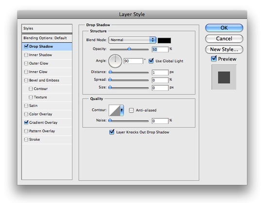
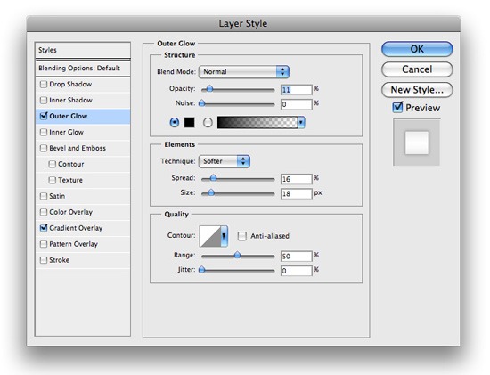
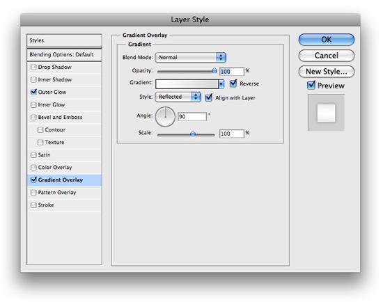
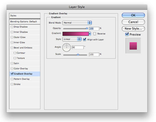
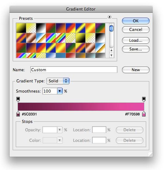
 19 Then, for the tagline, add an Outer Glow and a Gradient Overlay layer style.
 You should now have something like the following image.
  20 The last thing we need to do to our header is add a little 1px-high shine to the bottom. Make a 1px-high selection using either the Rectangular Marquee Tool (M) or the Single Row Marquee Tool from the Tools Panel across the bottom of your header and fill it with white.
 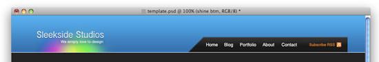 21 Lower the opacity of the layer to about 64%, and then change its blend mode to Soft Light.
You should now have something like the following figure. 
Working on the blog entry’s design
22 Time to move onto how our posts will be displayed. Using your Rectangle Marquee Tool (M), make a square selection similar to the following, and on its own layer, fill it with white (#FFFFFF). This will hold the thumbnail images of each blog post entry.
 23 Now insert a Gradient Overlay layer style with the settings below.
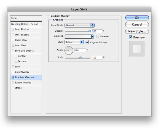
 24 Using your Rectangle Marquee Tool again, make a selection beside the thumbnail holder, and on it’s own layer, fill it with white (#FFFFFF). This will contain the blog post entry excerpt text.
 25 Next, we need to make a highlight and a shadow in between the two boxes. Use the Rectangular Marquee selection and the figure below to make these 1px inset dividers.
  26 Using your Rectangle Marquee Tool again, make a selection similar to the following and fill it with black (#000000).
 27 Now, add a Gradient Overlay layer style onto this layer.
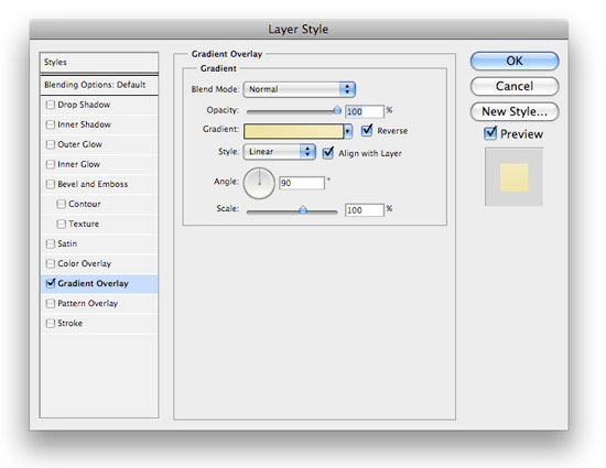
 Your blog post entry section should now look like the figure below.
  28 Use the Rectangle Marquee tool again to make a 1px-high selection (create a new layer) at the top of the blog post entry excerpt box you created to make a nice little shine.
Lower this layer’s opacity to 29% or so. ![]() 29 The last thing we need to do for the blog post entry design is to create the button for the ‘continue reading’ link that will lead the users to the full blog post. Using your Rectangular Marquee Tool (M), make a selection similar to the following and fill it with black (#000000). Use the Horizontal Type Tool (T) to add the text to the canvas using a foreground color of white (#FFFFFF).
29 The last thing we need to do for the blog post entry design is to create the button for the ‘continue reading’ link that will lead the users to the full blog post. Using your Rectangular Marquee Tool (M), make a selection similar to the following and fill it with black (#000000). Use the Horizontal Type Tool (T) to add the text to the canvas using a foreground color of white (#FFFFFF).
![]() 30 Next, insert a Gradient Overlay layer style to the button’s layer.
30 Next, insert a Gradient Overlay layer style to the button’s layer. 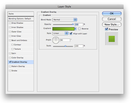
 31 Finally, add some content to make your design look like the following figure. Adding sample content will make the mockup look more realistic for when you show it to your client.
Designing a pagination blog feature
32 Many weblogs display pagination links at the bottom so that you can easily navigate through older posts. Let’s go ahead and get the simple pagination layout out of the way. All I did was add some text. For the active page, I used a Gradient Overlay layer style.
Designing the Sidebar
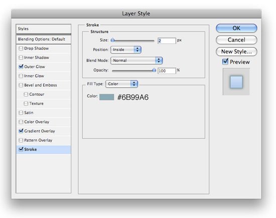
33 Time to move onto our sidebar. Use your Rectangle Marquee Tool to make a selection on the right of the blog post entry area, and fill it with black (#000000).  34 Next, add an Outer Glow, a Gradient Overlay, and a Stroke layer style.
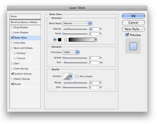
 35 We’ll reserve 125px x 125px ad banners spots at top part of the sidebar design, so want to leave enough space for them. We also want to add a little search area. For the headings, I used the font Helvetica CY.
I have set the font weight option to Plain for the “Search” text and Bold for the “Blog” text. For the dotted lines acting as a divider, just use the Horizontal Type Tool (T) with the Color option set to the value of #79818D and then write “———-“. 36 Add some icons beside the headings text. 37 For your Search box, use the same layer style used in Step 30 and add a Stroke layer style with the following settings. 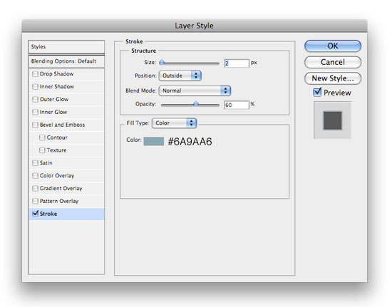 38 Repeat the above steps to add more sections on the sidebar.
Here’s what I ended up with: 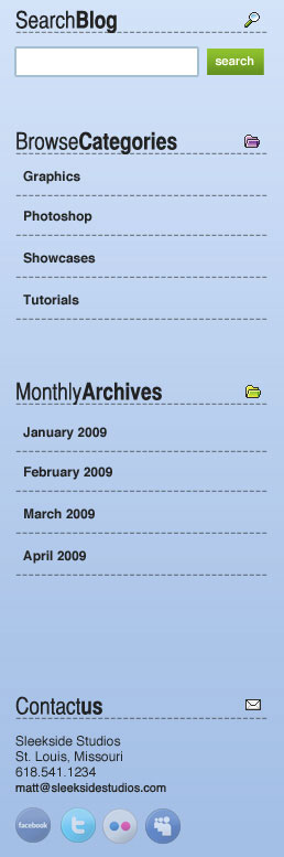
Creating the layout’s Footer section
39 Now, it’s time for the Footer. Make sure that the layers of the Footer are all under your sidebar layers. Using your Rectangle Marquee Tool (M), make a selection similar to the following, and fill it with #000000. 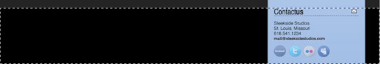 40 Now add a Gradient Overlay layer style onto the layer from above.
 41 Using your Rectangle Marquee again, make a 1px-high selection and fill it with white (#FFFFFF) to make a shine on the top part of your footer.
 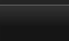 42 Lower the opacity of the 1px divider/shine to 24%, and set the layer’s blend mode to Soft Light. All that is left now is to add some sample content in a similar manner as the sidebar.
And…
you’re done!
Congratulations, you’ve finished the tutorial. If you followed along, you should have something like the following figure.
Download the source file
If you’d like to check your work with mine, you can download the final PSD file below.
- impressive-blog-layout.zip (ZIP, 0.97 MB)
Share your work on Flickr!
If you followed along, why don’t you post your work in the Six Revisions User Group on Flickr? We’d love to see what you ended up with!
-
 President of WebFX. Bill has over 25 years of experience in the Internet marketing industry specializing in SEO, UX, information architecture, marketing automation and more. William’s background in scientific computing and education from Shippensburg and MIT provided the foundation for MarketingCloudFX and other key research and development projects at WebFX.
 -

WebFX is a full-service marketing agency with 1,100+ client reviews and a 4.9-star rating on Clutch! Find out how our expert team and revenue-accelerating tech can drive results for you! Learn more
Make estimating web design costs easy
Website design costs can be tricky to nail down. Get an instant estimate for a custom web design with our free website design cost calculator!
Try Our Free Web Design Cost Calculator
Share this article


Web Design Calculator
Use our free tool to get a free, instant quote in under 60 seconds.
View Web Design CalculatorMake estimating web design costs easy
Website design costs can be tricky to nail down. Get an instant estimate for a custom web design with our free website design cost calculator!
Try Our Free Web Design Cost Calculator


