


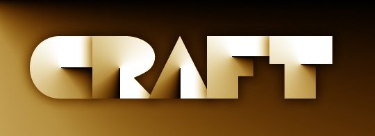
Papercraft Text Effect
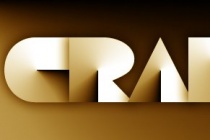
Wired Magazine introduced on the September 2008 issue a new headline design created by Mario Hugo. This cool headline design struck me with its beauty and simplicity. So I decided to turn this effect into a Photoshop tutorial. Although the effect is a bit different, all credit should be given to Mario Hugo.
Since he designed a custom typeface for these headlines, I had to find some similar typefaces to apply this effect. The first and obvious choice was the popular Baby Teeth font. Fortunately there are a lot of free alternatives, and one of them is Disco Deck by Iconian Fonts.
As usual, my tutorials are very long. It is not that the effect is difficult to achieve. In fact it is very easy. It is just because I don´t want to leave beginners out in the cold. Each step, no matter how easy it is, is explained in detail. Of course, I can unintentionally leave something unexplained, but I expect everybody, with a minimum Photoshop experience, to be able to follow the tutorial and reach the final result.
Hope you like this effect and if you come up with the same effect using a different font, please leave a link at the comments section, as usual.
- Source : http://www.photoshoproadmap.com
- 3851 hits
- Category : Text Effect
Final Preview :
Add a comment on Papercraft Text Effect